A Major Rotation Toward Gold Stocks May Be Underway
The bottom is well behind us.
The more important question now is what comes next for Gold and gold stocks.
There is a key development taking place beneath the surface.
Gold stocks are outperforming Gold now, and over the quarters ahead, capital could shift away from technology stocks toward Gold and gold stocks.
Several charts are worth watching closely.
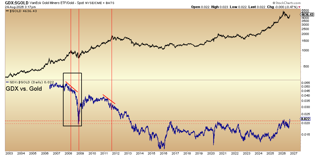
GDX closed last Friday at a fresh 13-year high versus Gold, on both the daily and weekly charts.
Despite widespread concern about a stock-market crash and a repeat of 2008, gold stocks are acting in the opposite fashion.
This breakout suggests gold stocks will outperform bullion in the years ahead.
It is a very bullish development for the entire precious-metals complex.
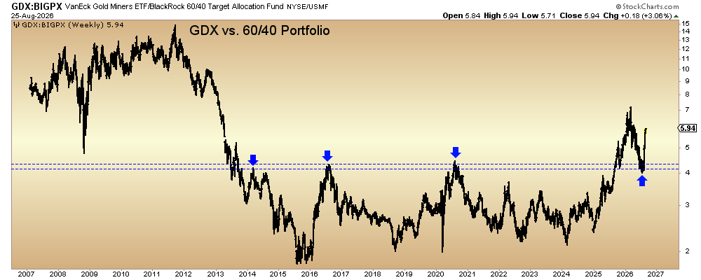
The comparison with a conventional 60/40 portfolio tells a similar story.
In 2025, GDX broke out from a 12-year-long base against the 60/40 portfolio. The ratio declined in 2026 but successfully retested that breakout.
This action implies that capital may be resuming its move away from the conventional 60/40 allocation and toward gold stocks.
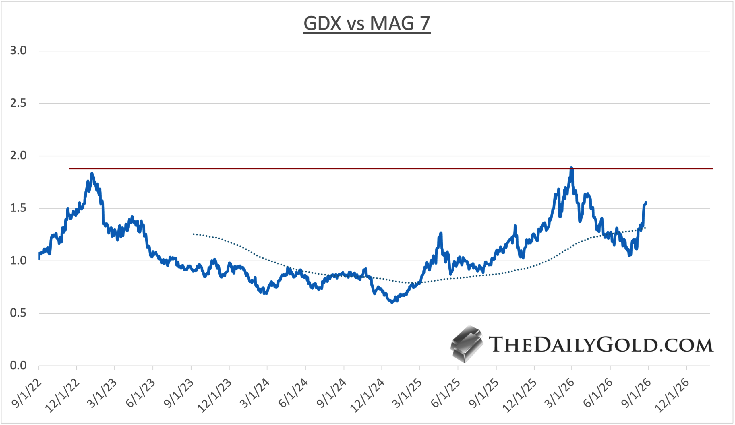
The GDX-to-Magnificent 7 comparison adds another dimension.
The MAGS ETF is only three years old, so the ratio was calculated manually to extend the chart further back.
The ratio still has work to do, but it should eventually test a five-year resistance level.
The Magnificent 7 have powered technology, and technology has powered the secular bull market in the S&P 500. An eventual breakout in this ratio would therefore confirm a major shift in market leadership.
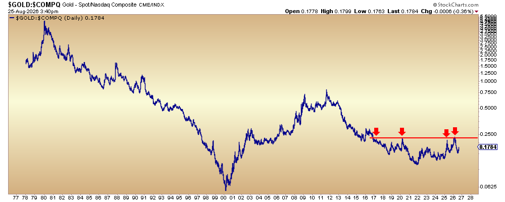
Turning to Gold, the Gold to Nasdaq chart may be the most important big-picture macro and precious-metals setup to watch.
Gold is trading within a 10-year-long base against the Nasdaq, although it still has work to do before testing major resistance.
The breakout is not imminent, but when it occurs, it would signal a major rotation of capital out of technology and into Gold.
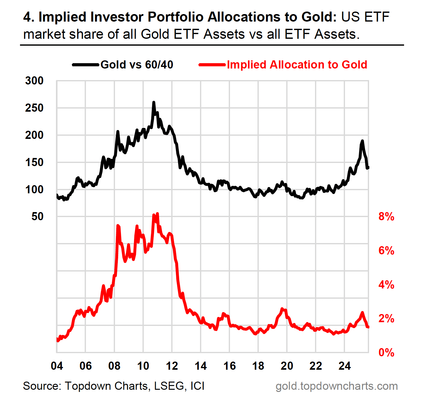
Another useful Gold chart comes from Callum Thomas of Topdown Charts.
It plots assets in all Gold ETFs against total ETF assets.
That makes it an excellent sentiment indicator because it is based on real money and measures Gold’s allocation relative to everything else.
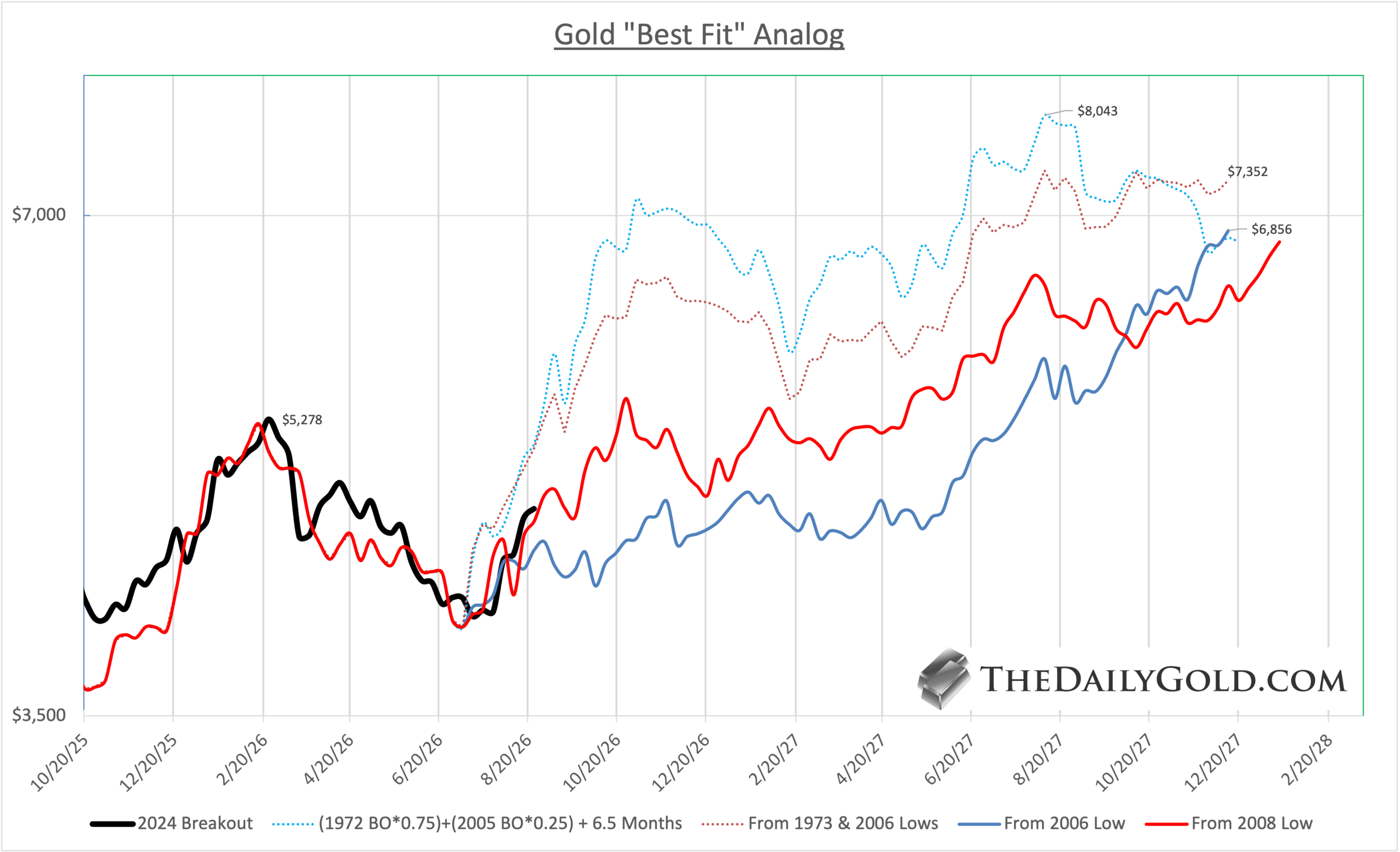
Finally, we project a path for the Gold price using historical data.
Here we plot the rebounds from historical “post-breakout” corrections on the current scale.
The best fit has been a composite of 75% of the 1972 breakout and 25% of the 2005 breakout delayed by 6.5 months.
It’s unlikely Gold will follow the moonshot trajectory of the 1973 rebound.
However, the 2006 and 2008 rebounds are a reasonable expectation, putting Gold very close to $7000/oz in 16 to 18 months.
The key message is that the bottom is no longer the issue.
The market’s next phase may be defined by relative-strength breakouts: gold stocks versus bullion, gold equities versus conventional allocations and mega-cap technology, and Gold itself versus the Nasdaq.
None of these moves should be treated as automatic, and several charts still have resistance to overcome.
But the technical groundwork is increasingly consistent with a broader rotation toward precious metals—and with a much more powerful phase of the bull market ahead.
To learn the gold and silver stocks we own and cover with 5x upside potential, consider joining our premium service.