Morningstar’s Bull Markets Chart Omits Many Bear Markets
Morningstar has a chart showing historical bull markets that has not only been making the rounds on Twitter, MarketWatch and elsewhere, but has been receiving praise. Here is an article from MarketWatch posted today. It’s also received quite a bit of attention on twitter.
The chart has many errors and omits many bear markets as you can see in the annotated chart below. It even omits a 60% decline in a devastating bear from 1937 to 1942. It neglects the 26% bear from 1980-1982. It missed a few other minor bears.
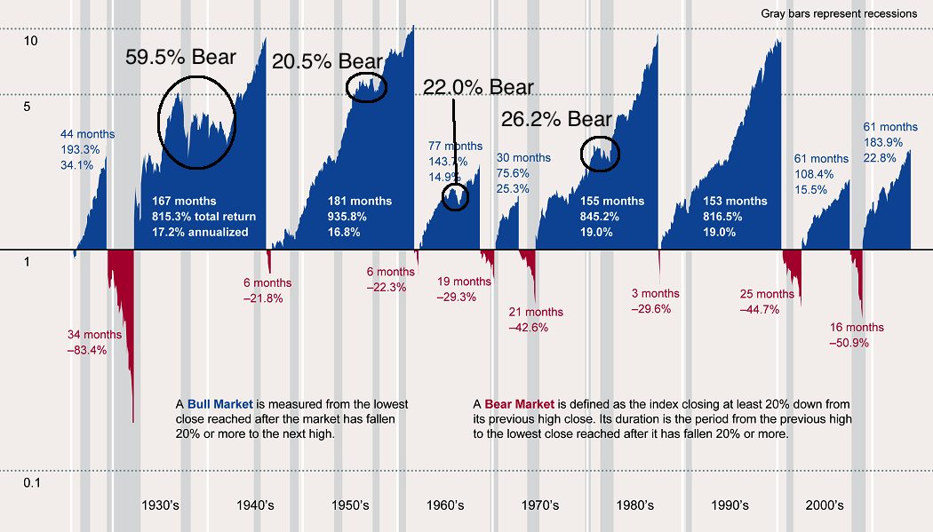
People look at the chart and falsely assume that the current bull market is quite tame compared to others. That is not the case. @UrbanCamel who has an excellent blog has already debunked this data and chart. Here is the data which better compares the current bull to history. The data shows that the current bull is already one of the longest and largest. Its clear that another bear is on the horizon sooner rather than later. The debate should be will it be tame (~20%), mild (~30%) or severe (~40%.)