A New Cyclical Gold Stock Bull Market Is Born
Now, keep in mind that I favor physical Gold over Gold stocks over the long term and, in fact, own no Gold stocks for the long term. My long-term holdings are in physical Gold held outside the banking system. This is the safer place to be during this nasty secular common stock bear market, particularly when sovereign defaults are the theme of this next decade. We will not exit this secular common stock bear market until we have a new monetary system based on a modicum of common sense – in other words, one that involves Gold.
Let Charlie Munger speak of how uncivilized it is to make a lot more money than he has for shareholders over the past decade by holding a shiny piece of metal instead of the paper promises of Wall Street’s “finest.” Sounds like sour grapes to me. By the way, shiny metal will continue to far outperform the Berkshire Hathaway stock price over the next several years – of that, you can be sure.
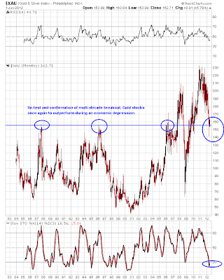
To the charts, I say, as this is where the answers lie in my opinion once one understands the fundamentals. Here’s a “big picture” view of the XAU Mining Index ($XAU) using a monthly log scale plot over roughly the past 30 years thru Friday’s close:
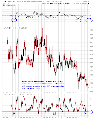
Others might say that we are headed for another 2008-style meltdown and we are going to lose that blue support line again, as we did in 2008. Hey, that’s what makes a market. But there are fundamental and technical reasons for why we ain’t going there again any time soon. The most important, in my opinion, is the fact that Gold stocks have already crashed relative to the Gold price. Here’s a monthly log scale view of the XAU Mining Index divided by the price of Gold ($XAU:$GOLD) thru Friday’s close:
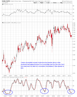
Over the long term, it is apparent that Gold stocks have underperformed the metal and may well continue to do so for the longer term haul (i.e. next decade). However, speculative gains during a cyclical Gold stock bull come fast and furious once Gold stocks decide it is their turn to lead the way. Next up, the “Gold stocks to common stocks” ratio, using the XAU and the S&P 500 as proxies ($XAU:$SPX) on a monthly chart over the past 13 years thru Friday’s close:
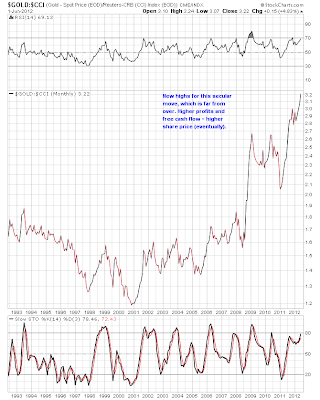
Furthermore, the fundamentals continue to improve for producing Gold companies due to a rising “real price” of Gold. I learned this concept from Bob Hoye and it makes sense. When the Gold price is rising relative to the cost of mining (regardless of what the nominal price of Gold is doing), operating margins for producing miners should improve, all other things being equal (which they never are…). Using the Gold price divided by the price of a basket of commodities, we can get a rough estimate of this trend. Here is a 30 year monthly chart of Gold divided by the CCI commodities index ($GOLD:$CCI) thru Friday’s close using a log scale format:
This is where the “Dollar to zero” and hyperinflation crowd misses some of the nuances along the way. Sure, every currency becomes worthless eventually, but the turns along the way are what make things interesting to those who follow markets. For example, despite being a staunch Gold bull, I have been looking for a new cyclical bull market in the US Dollar Index since last summer, and I don’t think the one that seems to be developing is over yet by a long shot. All currencies are declining against Gold, but doing so at different rates.
And if you are into technical analysis, you should have noticed the volume on the GDX ETF. May was the highest monthly volume in the history of GDX (with a bullish monthly candle to mark a bottom) and Friday was the highest daily up volume in the history of the GDX ETF. Clearly, the big boys see the same things I do and have now established their positions. They are doing so at a time when sentiment in the Gold stock sector is as poor as it has been since the darkest days of the 2008 panic.
I had to smile at the number of recent articles I have seen describing how much Gold stocks suck and how they will never outperform the metal. Perfect! Here’s my homemade sentiment chart using the data from the Rydex Precious Metals Mutual Fund (a PM stock fund), the plot showing the net asset value (NAV) of the fund (i.e. amount of money in the fund) over time. When the plot is low, the money in the fund is low, which is generally a combination of declining prices and money withdrawals from the fund. When the herd is bearish (i.e. NAV low), you want to be bullish and vice versa. Here’s a 10 year plot of the NAV of the Rydex fund thru Friday’s close:
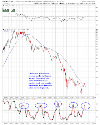
I’d say we’re not going to get much lower than the 2008 meltdown, but feel free to disagree. The turn has already come and gone, in my opinion. However, the bulk of speculative gains in this cyclical Gold stock bull market are ahead of us. For those with a longer-term view, ignore the squiggles until the GDX is 80 or more and we’ll get there within a year if history is reliable guide. For those who like to try to play/trade the shorter term swings in the volatile Gold mining sector, consider giving my low cost subscription service a try (it’s only $15/month). For those with a lower risk tolerance, simply hold onto your Gold until the Dow to Gold ratio gets to 2 (and we may well go below 1 this cycle). Speaking of my favorite secular road map chart, it looks like we have finally made the turn – here’s a monthly log scale chart of $INDU:$GOLD over the past 15 years thru Friday’s close:
