Market Breadth Worries
Market Breadth Worries!
Chart 1: S&P 500 together with new NYSE 52 week highs & lows
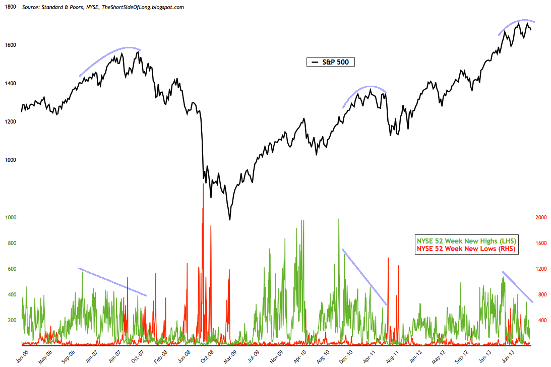
While the S&P 500 has been making all time new highs in recent months, the internals of the stock market index suggest a different picture. The chart above shows that the NYSE number of stocks making new highs decreasing at every new marginal high the market made, indicating that the rally is running out of fuel. Similar occurrence were seen at the 2007 and 2011 tops.
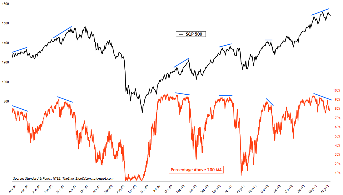
One of my favourite indicators to follow is the percentage of stocks trading above the 200 day moving average, as seen in the chart above. This indicator is useful to track bullish and bearish divergences, as certain stocks will turn in opposite direction to the overall market and be a major “tell tell”. Furthermore, this indicator is also useful on nominal basis too, as it tells us whether the stock market is overbought or oversold.
As a general rule above 80% is overbought and below 20% is oversold, but markets do spend a lot more time in overbought range (as the rally is a prolonged process), so this is where non-confirming divergence becomes a leading indication that all is not well. And, as the chart shows, we have a major one right now, so it is time to pay attention.

Interestingly enough, NYSE advance decline line (cumulative) has not given us any bearish signals during 2011 top, even though the market crashed by over 19% in August (Russell 2000 was down even more, just like other global indices). So the indicator does not always work properly, but here we are with a first major bearish divergence since 2007. I’m definitely paying attention to the way this indicator is behaving right now and so should you.

Bullish Percent Index measures the percentage of stocks within the index, that remain on a technical P&F buy signal. For the lack of simpler wording, I would just describe it as an indicator that measures the percentage of stocks in an uptrend (removing the complexities for the time being). This indicator can be used in two ways: first – it can track bullish and bearish divergences; and second – it is also useful as a nominal reading of overbought and oversold levels (once again 80% and 30% work here better).
As we know, near market peaks, certain stocks tend to start breaking down before the overall index turns down too. This indicator is a perfect example of that happening, whether it was intermediate peaks in April 2012 and October 2012; or whether it is major peak in early to mid part of 2011. Are we looking at another major peak? bearish divergence has been going on for several months now, so pay close attention.